UPDATE: You may now purchase this font for personal or commercial use at www.nycsubwayfont.com

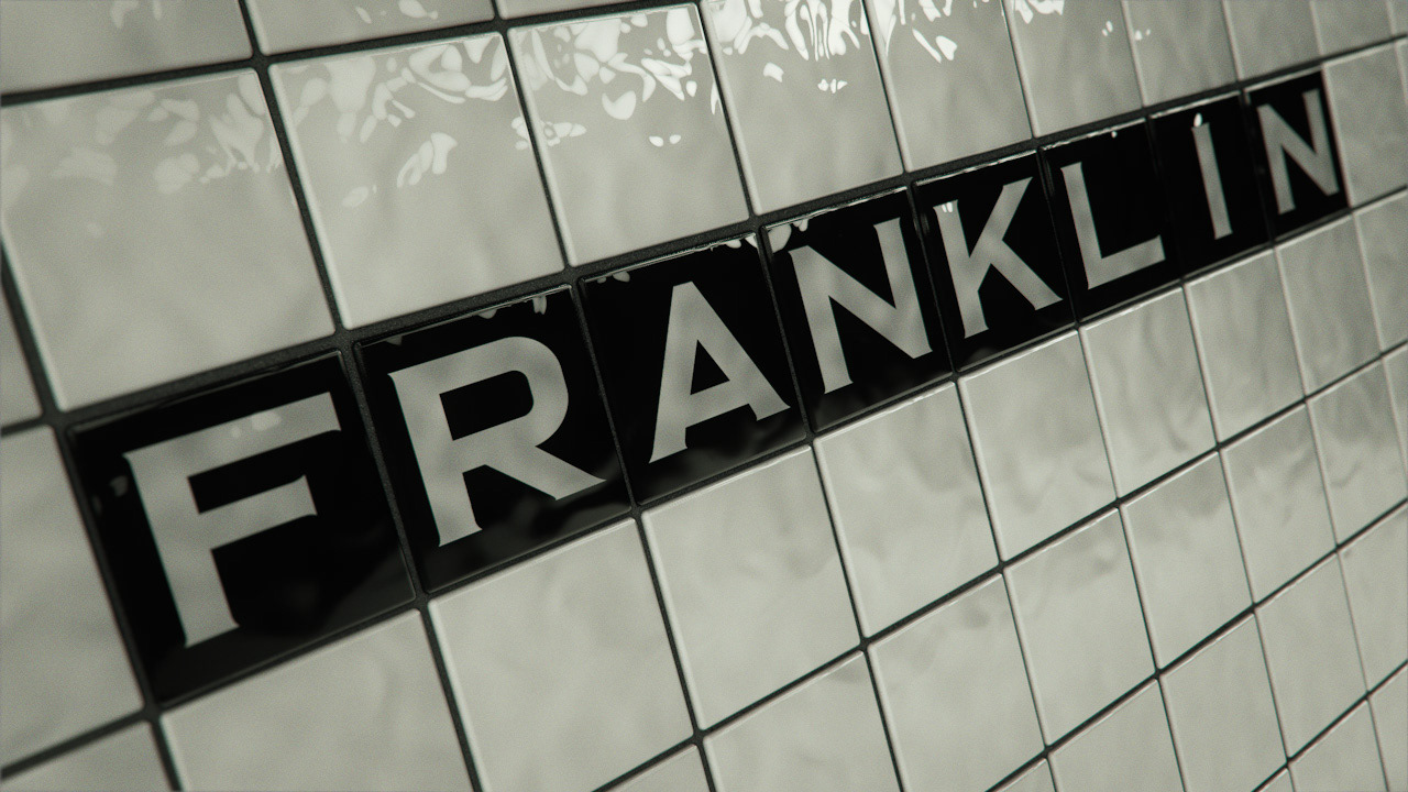
I began by photographing tiles while waiting for the train. This is from Franklin Avenue on the C Line near my apartment in Crown Heights, a logical place to start :)
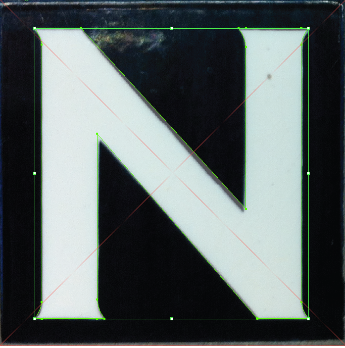
Then I edited the photos in Photoshop separating them into individual letters and removing any distortion due to my taking the photos at a slight angle. Making individual PSDs also made it easier for me to keep track of what letters I'd taken photos of and which ones I was missing.
From there, the process was fairly straighforward. I placed the PSDs into Illustrator and began tracing the letterforms.
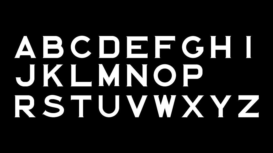
This was a first pass at recreating the letterforms in Illustrator. At this point, I'm missing a photo of a "Q" and I synthesized both the "X" and the "Z" from elements of other letters.
Since the original tiles were all hand lettered, there was a fair amount of disparity among letters. The "S" at one station would look slightly different from an "S' at another station.
Also, all of the subtle serifs had variations, which I decided to try and standardize in the second pass.
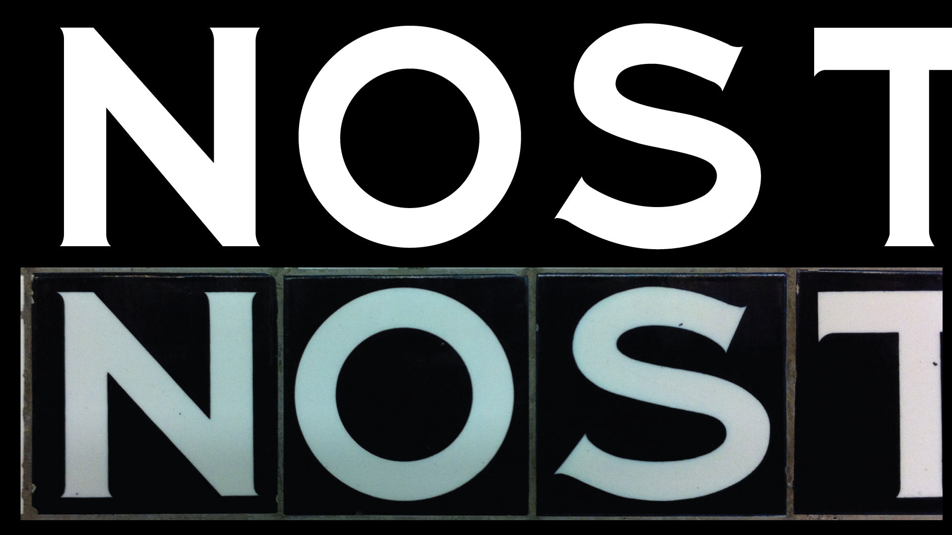
This is the second pass with a more consistent serif. As many of my friends pointed out, that "S" still needs some work!
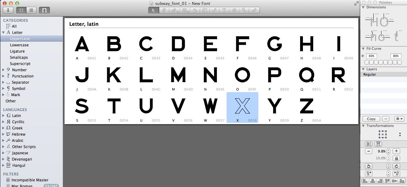
The last time (and the only time!) I'd ever made a font was when I was in school at Ex'pression College for Digital Art back in 2007. Since I'm not a font designer and I was trying to keep this project relatively simple, I started looking for a basic font editing program that would allow me to import Illustrator paths.
The first app I tried was Font Constructor, but that proved to be prone to crashing and was a little hard to use. Then I found Glyphs which seemed to be able to do everything I needed. As a trial, I imported the paths from Illustrator, set the spacing to monospaced and exported an OTF.
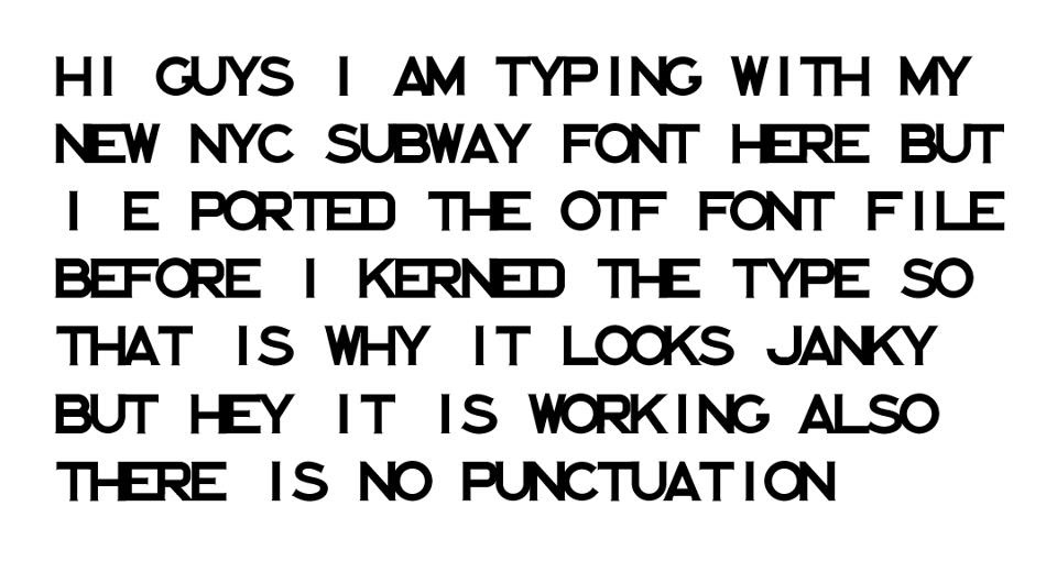
This is me typing with the OTF before I figured out how to set the letter spacing :)
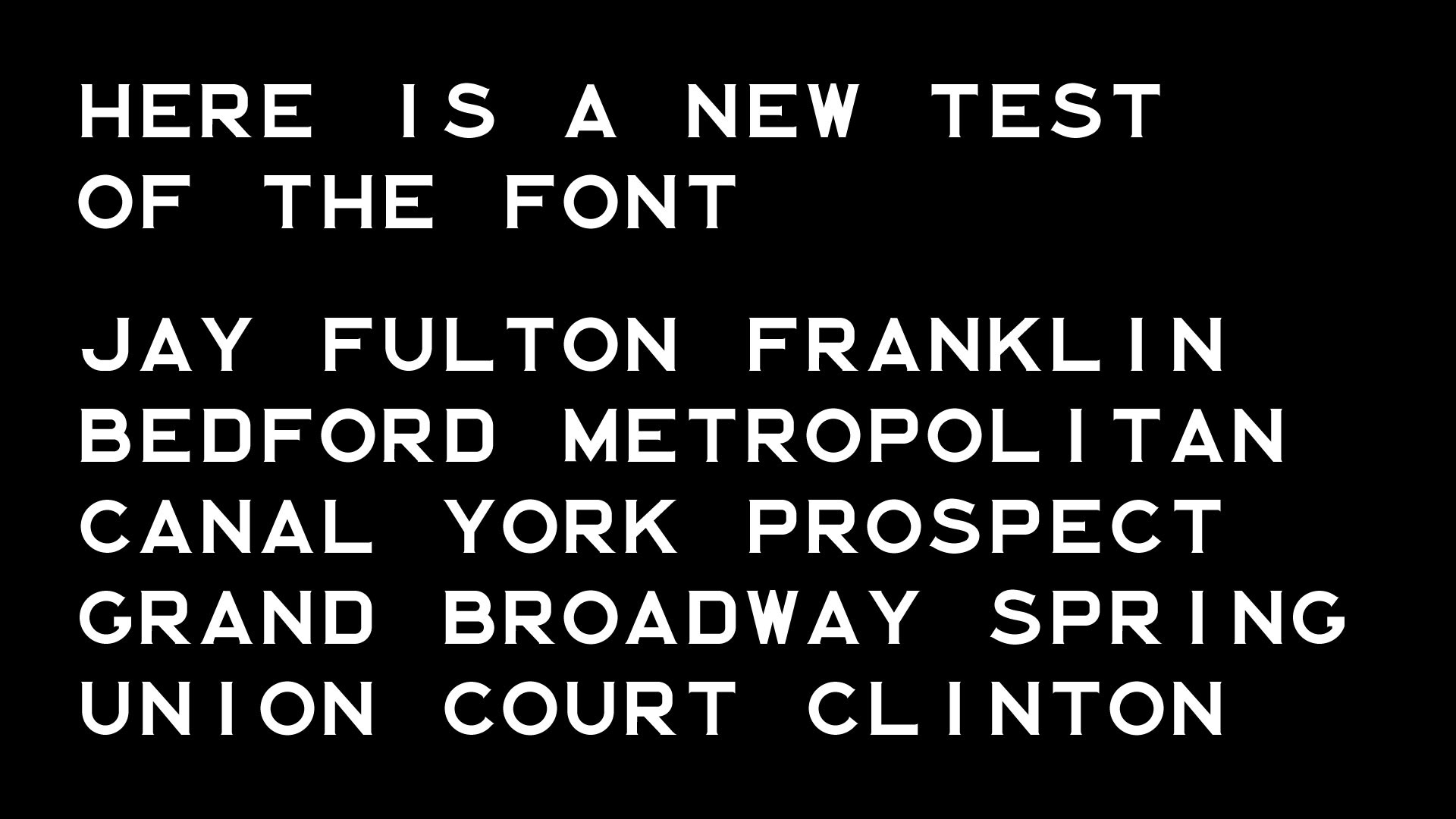
This is after I figured out how to set the letter spacing. It just looks better white on black, don't you think? Gotta come up with a solution to that floating "I" but I'd like to keep it monospaced and true to the original tiles.
One suggestion from a friend that I agree with is to make more than one version: one monospaced and one with adjusted kerning.
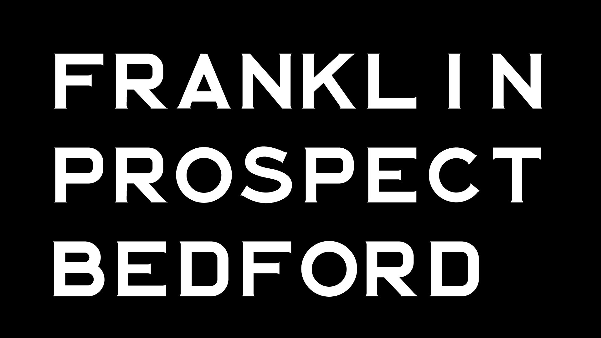
The serifs are so subtle, that you they kind of get lost unless the font size is large.

Extreme closeup! Yikes, the top of the "A" is a bit crooked. Will fix that in the next round.
Here's the font in action! I made some cubes in Cinema 4D, cloned and textured them and added the font as a material. Looking forward to animating some of this.
History of the New York Subway tiles and typefaces
Squire J. Vickers was an architect and lead designer for the subway system from 1908 to 1942 and was responsible for 300 station designs. Here's a NYTimes article about Vickers.
The question remains: Who designed, manufactured and hand lettered the tiles? This short article in The New York Times identifies architects George C. Heins and Christopher Grant La Farge
From the article THE (MOSTLY) TRUE STORY OF HELVETICA AND THE NEW YORK CITY SUBWAY:
"For the IND Vickers also added a second set of modular tiles for the station names. These were integrated into the station walls rather than being attached to the platform columns. The lettering of these signs is in a spur serif style—common in 19th-century sign-painting manuals—that is reminiscent of social invitation typefaces such as Copperplate Gothic."
From Forgotten New York:
"Vickers also designed smaller, black and white directional signs pointing to the closest exits, with a simple arrow pointing in the direction the traveler should go. These signs featured a font quite like Copperplate, the font I use (along with Franklin Gothic) for FNY title cards. It wasn’t Copperplate, though; the font featured small, “vestigial” serifs much like Copperplate but it wasn’t quite the same. I wonder what the font name was."
I'm using a font editor called Glyphs to import the Illustrator paths and export to an Open Type Face.
Links:
A complete copy of the New York City Transit Authority Graphics Standards Manual from 1970
An incredible online resource NYCSubway.org has photos from every station and a wealth of historical info
Subwaynut.com also has photos from many NY Subway stations
Tiles in New York blog
A gorgeous poster for SVA from Louise Fili